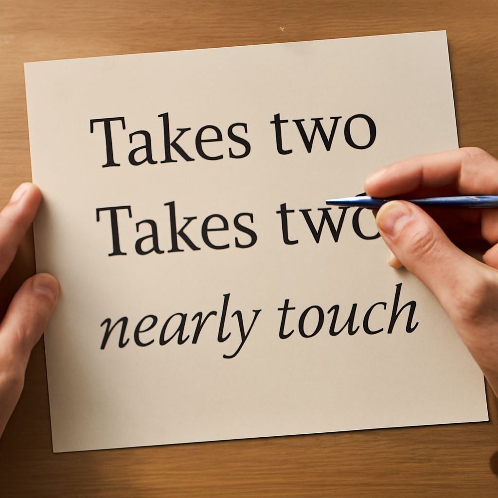
Kerning in Word refers to the adjustment of space between specific pairs of letters to improve the appearance and readability of your text. Fine-tuning kerning and character spacing in Word can give your documents a polished, professional look. Whether you’re designing a headline, creating a flyer, or formatting a resume, understanding how to control these settings ensures your text looks balanced and intentional.
What Is Kerning in Word?
Kerning in Word specifically means changing the spacing between individual letter pairs, rather than the overall space between all characters. Proper kerning prevents awkward gaps or overlaps, which are especially noticeable in large fonts or decorative typefaces. For example, the space between the letters “A” and “V” often needs tweaking to avoid a visually distracting gap.
Microsoft Word lets you adjust kerning for selected text, but this feature mainly works with larger font sizes or certain fonts that support advanced typographic features. Kerning is distinct from tracking, which means adjusting the spacing across a whole word, line, or paragraph, and from leading, which is the space between lines of text.
In professional design software, kerning controls can be very fine-grained. In Word, the tools are simple but effective for most business, academic, and creative uses. Kerning can make headlines look more cohesive and improve the flow of body text, even in everyday documents.
How to Adjust Kerning
Step-by-step instructions
To adjust kerning in Word, follow these steps:
- Select the text you want to adjust. For best effect, use a font size of 12 points or larger.
- Go to the Home tab, then click the small arrow in the bottom-right corner of the Font group to open the Font dialog box.
- Select the Advanced tab. (In older versions of Word, this may be labeled as Character Spacing.)
- Check the box labeled Kerning for fonts. Set the minimum point size for kerning, such as 12 pt.
- Click OK to apply your changes.
Word will now automatically adjust the kerning for the selected text or any text you type at or above your chosen size. If you want tighter or looser spacing throughout, you can use the character spacing options described in the next section.
Tips for best results
Kerning works best with headings, logos, or short blocks of text at larger sizes. For small body text, the effect is usually subtle or not visible. Certain fonts, especially professional or display fonts, respond better to kerning changes than basic system fonts like Arial or Times New Roman.
Always review your document at 100% zoom or print a test page to see kerning effects accurately. Over-kerning (too tight) can make letters blend together, while under-kerning (too loose) can make words harder to read.
Character Spacing Options
Expanded and condensed spacing
In addition to kerning, Word allows you to adjust overall character spacing. You can expand (widen) or condense (narrow) the space between all letters in your selection. To do this, use the Spacing dropdown in the Font dialog’s Advanced or Character Spacing tab. Choose Expanded or Condensed and enter the number of points by which to increase or decrease the spacing.
This setting affects all selected characters, not just letter pairs, and is commonly used to achieve specific design effects or to fit text neatly within a fixed space. For instance, expanded spacing can give a modern, open look to headlines, while condensed text can help fit longer titles in a small space.
When to use each setting
Use expanded character spacing for headings, banners, or invitations where a wide, airy look is needed. Condensed spacing can help reduce line breaks in tight layouts, such as footers or tables. Avoid excessive adjustments in long paragraphs, as extreme spacing changes can impact readability.
Pair kerning and character spacing adjustments selectively for best results. For most documents, leave body text at the default spacing and focus your efforts on display text or documents that need a design boost.
Common Kerning Issues
Troubleshooting font problems
Sometimes, kerning in Word doesn’t seem to work as expected. This can happen if you’re using a font that doesn’t support kerning pairs, or if your selected font size is below the minimum set for kerning. Try switching to a different font or increasing the font size to see if the option becomes available.
If letters appear unevenly spaced despite kerning adjustments, check if custom character spacing or other formatting is overriding your settings. Remove any added spacing and reapply the kerning feature from the Font dialog.
Maintaining readability
Always balance aesthetics and legibility when adjusting kerning and character spacing in Word. Text that is too tightly packed or too loosely spaced can distract readers or make your document look unprofessional. Whenever you make changes, preview your document in print and on screen at normal size to ensure your adjustments enhance both style and readability.